Category:
Web App Design
Business:
B2C
Date:
Oct 9, 2025
View Project
Stock research in India is split across 4–6 platforms — none of them talk to each other
Beginners abandon research because financial data feels overwhelming without context
Experienced investors waste 30–45 minutes per session just gathering information
Nobody has a single space to research, learn, compare, and track — without five open tabs
The core insight: The problem isn't missing information. Every number exists somewhere online. The problem is context — data without explanation, tools built for experts only, and no thread connecting learning to action.
Where It Started
My friend Veeru has been investing in stocks since college. Not casually — he actually reads balance sheets, tracks P/E ratios, and follows quarterly results. But one evening he called me frustrated. Not about the market. About the research.
"I spend 45 minutes just gathering data before I can think about a single company," he said. "Moneycontrol for news, Screener for ratios, Groww for charts, and then I open ChatGPT to understand half of what I just read. It's four tabs for one decision."
He wanted to build something that fixed this. He asked me to design it.
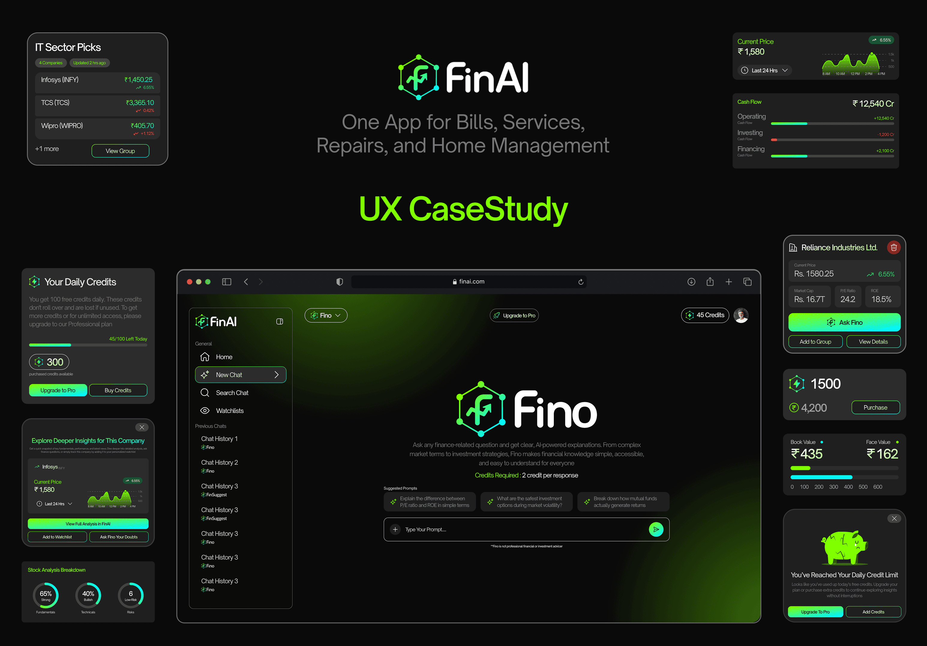
That was the beginning of FinAI — an AI-powered stock research platform with three focused AI models to help users research companies, understand financial concepts, and discover stock ideas. All in one place, without switching tabs.
Methodology
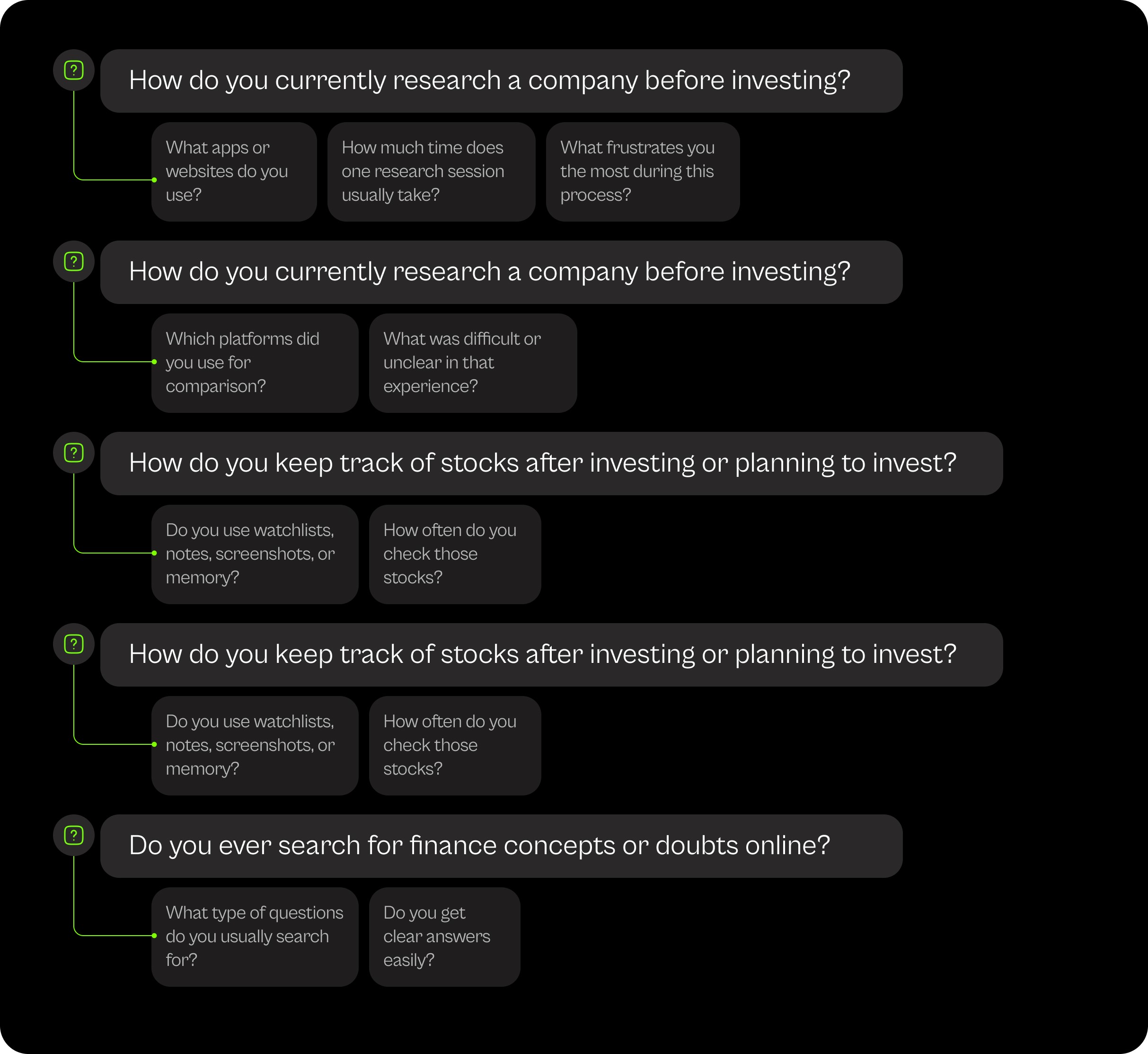
5 interviews — 3 active investors, 1 finance student, 1 startup founder (Veeru)
Format: informal, semi-structured, 25–40 minutes each
Also used ChatGPT to simulate a beginner investor and stress-test edge cases (acknowledged limitation — used to surface vocabulary and navigation questions, not as primary research)
What I Found
Beginner investors:
Feel like they're reading in a foreign language — P/E, ROCE, debt-to-equity appear everywhere, explained nowhere
Search a term, read a definition, forget it by the next tab, search again two weeks later
Avoid research entirely because the emotional cost feels higher than the payoff
Experienced investors:
Understand the data perfectly — just waste too much time collecting it
Comparing two companies manually takes 15–20 minutes before any real thinking begins
Want speed and clean side-by-side data, not explanations
Both groups:
Had no working watchlist system — screenshots, notes, and memory were the most common answers
Said they'd return to a tool that remembered what they were tracking
Preferred short sessions (10–15 min) over long research marathons
Zerodha Kite
Strength
Clean charts, trading interface
Gap
No education layer, no AI
Groww
Strength
Clean charts, trading interface
Gap
No education layer, no AI

Dristi Roy
Pain Points
Financial jargon is everywhere — P/E, ROE, ROCE — with no plain-language explanation attached
Jumps between 4–5 apps per research session and still feels uncertain at the end
Scared of making a costly mistake with hard-earned money
Gives up on research sessions more often than she completes them
Goals
Understand what financial numbers actually mean before acting on them
Track stocks she's curious about without pressure to invest immediately
Build confidence slowly — through learning, not guessing
Frustrations
"Every app throws too many numbers at me. I often don't know what actually matters, and I'm scared of making a costly mistake with my hard-earned money."
Arpit Dubey

Pain Points
Comparing two companies requires opening both on Screener, manually noting ratios, cross-referencing
Watchlists on existing platforms feel static — no quick actions, no smart grouping
No platform gives him a fast, meaningful stock summary without 3 clicks of setup
Goals
Fast access to fundamentals without explanation overhead
Side-by-side comparison built into the research flow, not a separate feature
Track potential investments in organized groups, not flat lists
Frustrations
"Data is scattered everywhere. Comparing two companies takes too many steps."
How I Approached It
Started by mapping all user problems onto a FigJam board and clustering by theme
Ran a MoSCoW exercise — pressure-tested every "must-have" against: Does it solve a core problem? Can we build it? Does it break at scale?
Filtered ideas through three hard constraints: development time, API budget, early-stage timeline
Goal: maximum user value with minimum system complexity
What I Cut — and Why
Real-time notification alerts — API cost too high for early stage
Broker portfolio sync — required regulatory approvals
Community/social features — out of scope for v1, adds complexity without core value
Advanced technical analysis overlays — Arpit would use them, but Dristi would be lost
Key Design Principles
Clarity over completeness — Show the most useful data at the right moment, not all data at once
Transparency builds trust — Credits, limits, upgrades — all visible, never hidden
One product feeling across three AI models — Users should never wonder which tab to use next
Design for Dristi first — If the anxious beginner feels at home, the experienced investor will too
Information Architecture
4 primary navigation items: Home, New Chat, Search Chat, Watchlists
Sidebar collapses to icon-only mode on data-heavy screens — financial tables need horizontal room
Chat history clearly labeled by AI model (FinAI / Fino / Fin Suggest) so users never feel lost
Credit balance always visible in the header — not as a warning, as information.
Key Layout Decisions
Three models, not one unified AI: Combining all capabilities into one AI would have created a confused interface. Separating them lets each model have a clear job — and lets users know exactly which one to reach for.
Loading animation on comparison screens: A deliberate pause while data fetches. Users who see financial data appear instantly tend to trust it less. A visible data load signals that real information is being retrieved — not cached or guessed.
Collapsible sidebar: Not cosmetic. Financial data tables need horizontal breathing room. The collapsed state was designed for the comparison screen specifically.
Credit card as dashboard element: The daily credit limit was a technical necessity. But showing it as a permanent, calm dashboard component — not a popup warning — turns a constraint into a feature. Users track it like a battery indicator, not a penalty.
User Flows
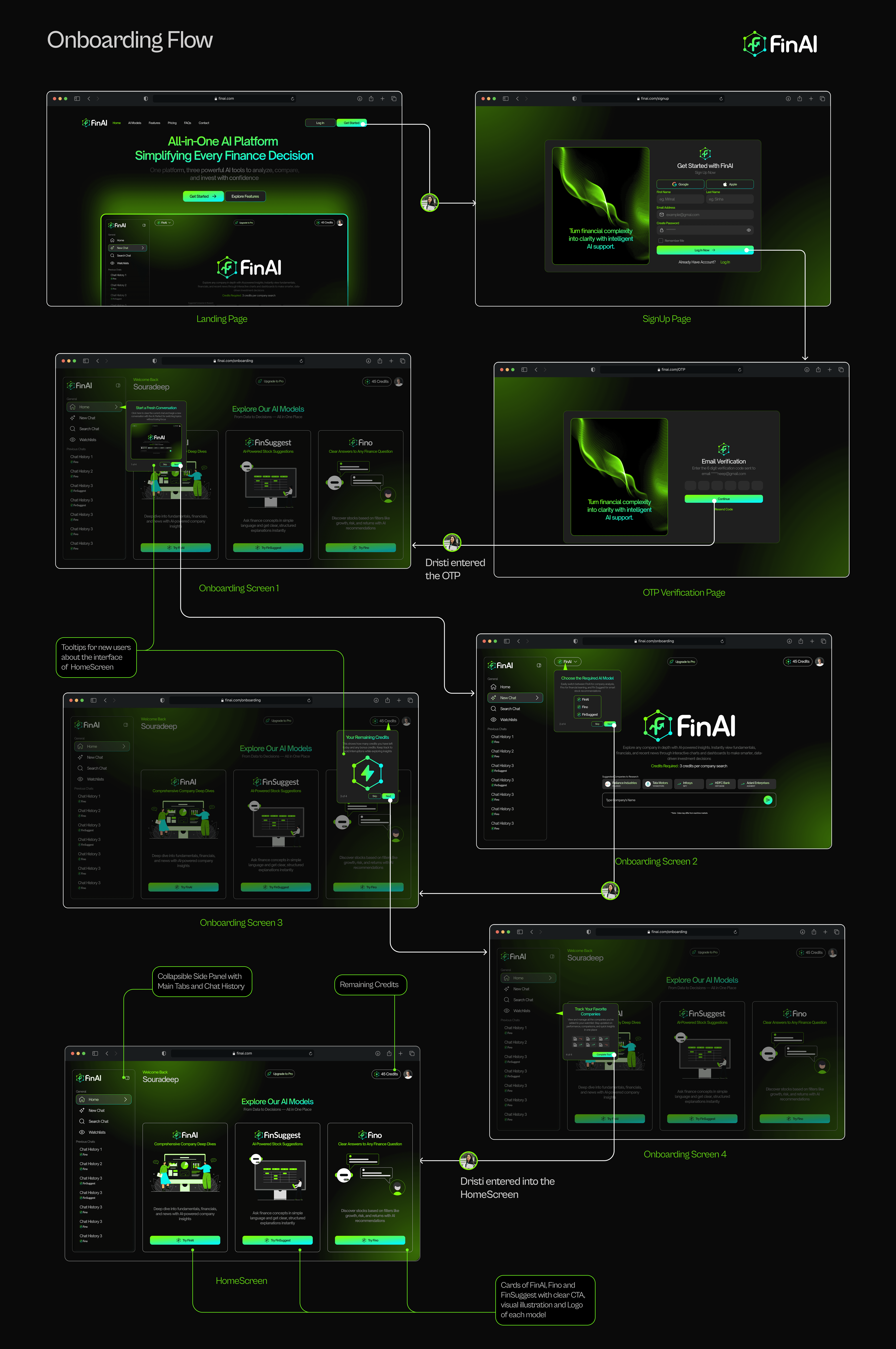
Design goal: Under 90 seconds from landing page to home screen.
Phone number signup or social login (Google, Apple, Facebook) — no email verification loops
4-screen guided intro: one screen per AI model, one sentence each — what it does and when you'd use it
Tooltip tour on first home screen visit — dismissable in one tap
Remaining credits shown in header from the very first session
Design Rationale
Social login and OTP-only signup removes every unnecessary field — users reach the product before hesitation sets in
Four onboarding screens introduce each AI model with one job description each — no feature overload before first use
Credits shown in the header from screen one — users know the system exists before they hit any wall
Tooltip tour on the home screen is dismissable in one tap — it guides without blocking the people who don't need it
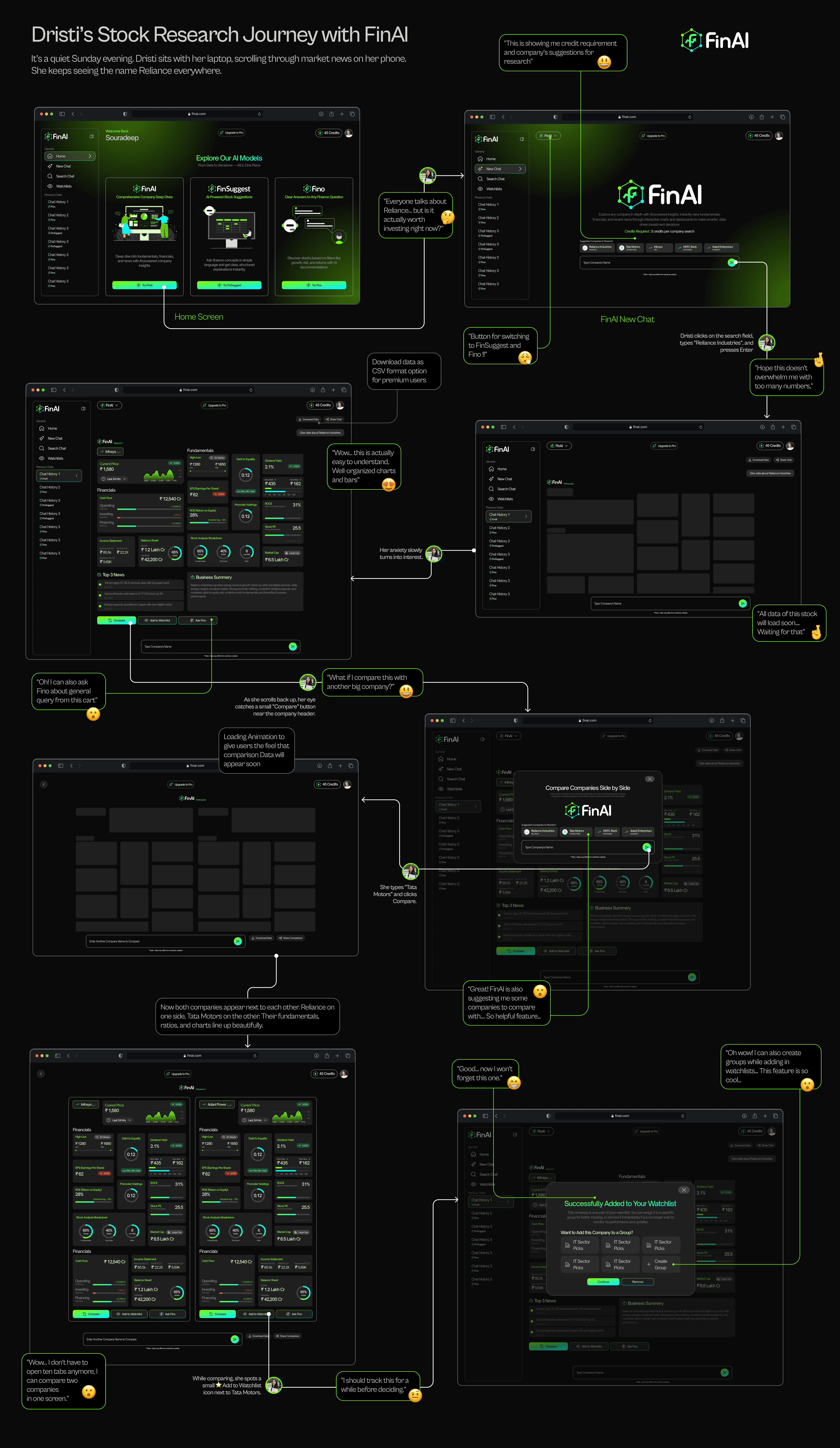
It's a quiet Sunday evening. Dristi keeps seeing "Reliance" everywhere — a Twitter thread, a WhatsApp forward from her dad, a random article. She opens FinAI. Not to buy. Just to understand.
Design Rationale
Loading animation before comparison data appears signals that real information is being fetched — not cached or guessed
Side-by-side layout aligns every data row between both companies — users compare without mentally translating between two different screens
Compare button lives near the company header, not buried in a menu — it shows up exactly when curiosity about another stock typically strikes
Watchlist prompt after comparison removes the need to remember — users save the stock in the same moment they decide it's worth tracking
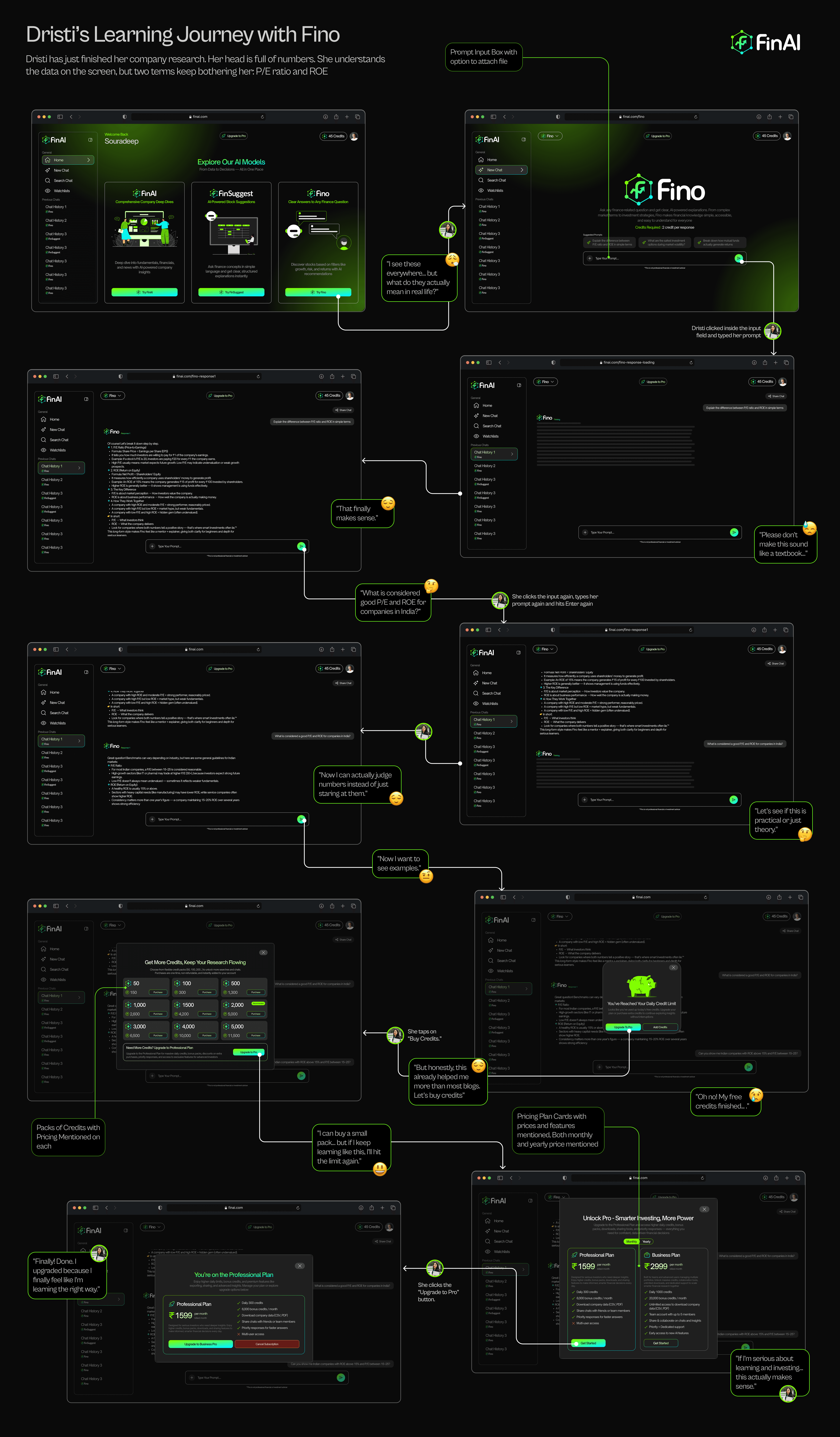
Two terms keep bothering her: P/E ratio and ROE. She's seen them everywhere but can't confidently explain what they mean.
Design Rationale
Conversational follow-up is designed to feel like asking a knowledgeable friend — no judgment, no jargon, no pressure to already understand
Credit limit appears only after genuine value is delivered — by then, upgrading feels like a reasonable choice, not a forced one
Pro plan is shown alongside credit packs — users who want to continue learning see both options at once without hunting through settings.
Fino responds with context and Indian examples, not definitions — a user who just read a balance sheet needs meaning, not a dictionary
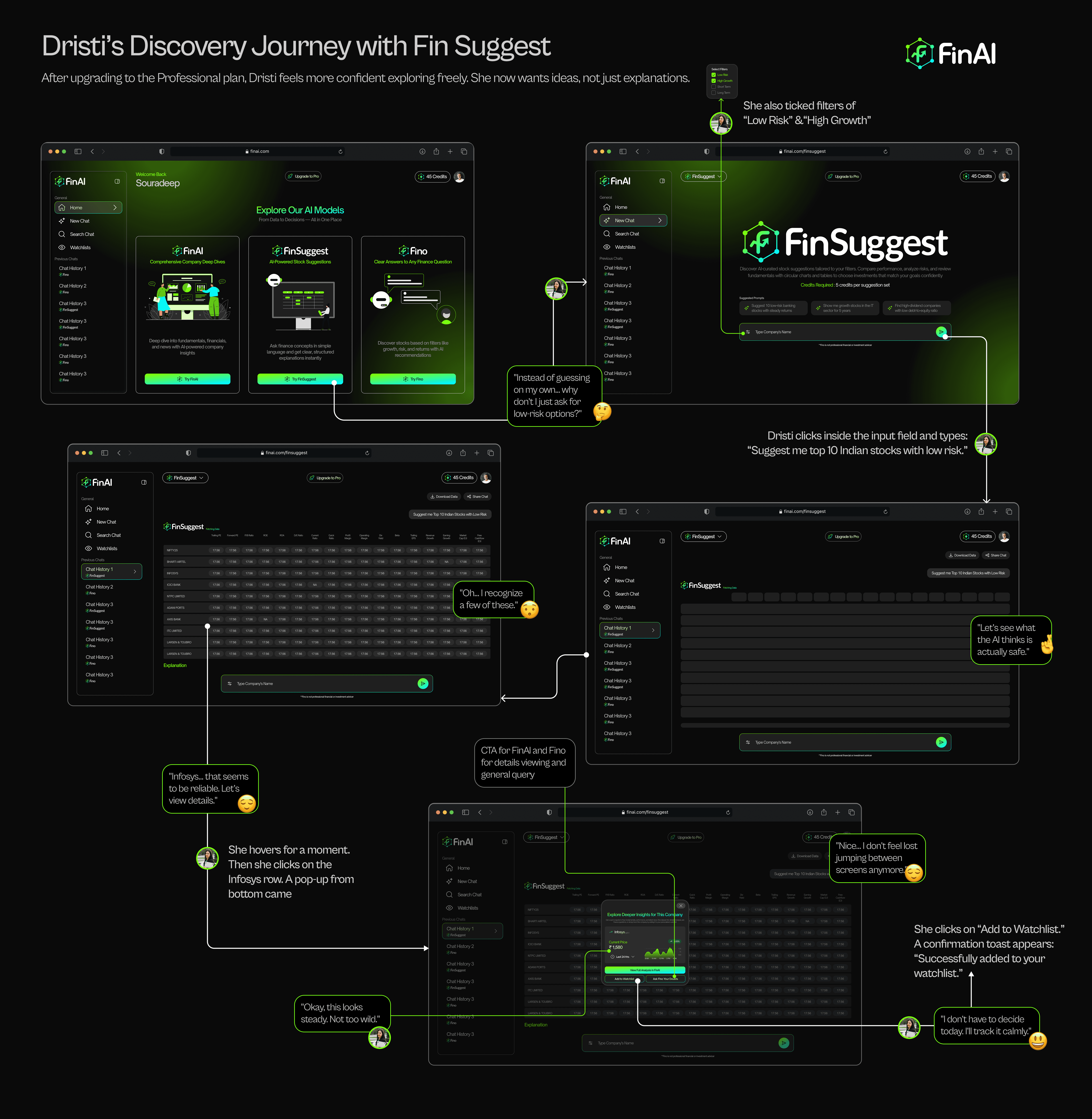
After upgrading, she wants ideas — not just explanations.
She opens Fin Suggest, sets two filters — Low Risk, High Growth — and types: "Suggest me top 10 Indian stocks with low risk."
Design rationale:
Bottom popup on row hover shows key data without navigating away — users evaluate a stock without losing the list they were scanning
CTA buttons inside the popup route directly to FinAI or Fino — the three AI models feel connected, not like separate tools with separate entry points
Watchlist save from inside the popup means ideas get captured instantly — no second step, no chance to forget before reaching the home screen.
Filters for risk and growth type sit before the prompt field — users frame their intent before asking, which produces far more useful results
After upgrading, she wants ideas — not just explanations.
She opens Fin Suggest, sets two filters — Low Risk, High Growth — and types: "Suggest me top 10 Indian stocks with low risk."
Design rationale:
Bottom popup on row hover shows key data without navigating away — users evaluate a stock without losing the list they were scanning
CTA buttons inside the popup route directly to FinAI or Fino — the three AI models feel connected, not like separate tools with separate entry points
Watchlist save from inside the popup means ideas get captured instantly — no second step, no chance to forget before reaching the home screen.
Filters for risk and growth type sit before the prompt field — users frame their intent before asking, which produces far more useful results
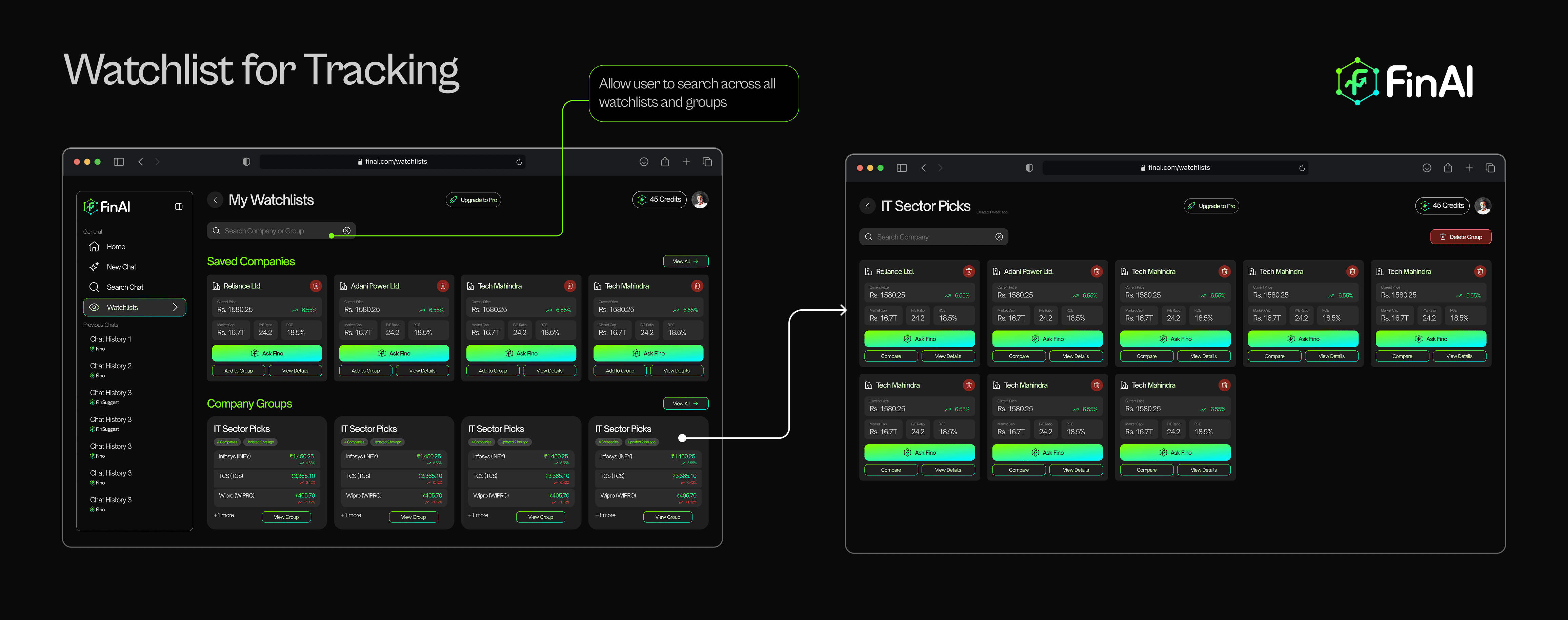
Search bar spans all watchlists and groups — users with 15+ saved companies can find any stock without scrolling through every card
Company groups let users separate short-term ideas from long-term plans — one watchlist trying to do both creates confusion, not clarity
Each card shows Ask Fino, Compare, and View Details without opening the company page — the most common next actions are already one tap away
Group view fills the full screen with company cards — users monitoring a sector see everything at a glance, the way they actually think about it
Explore the full Figma prototype showing every flow, animation, and screen. Hit play and experience how HomeHub works from a real user’s perspective.
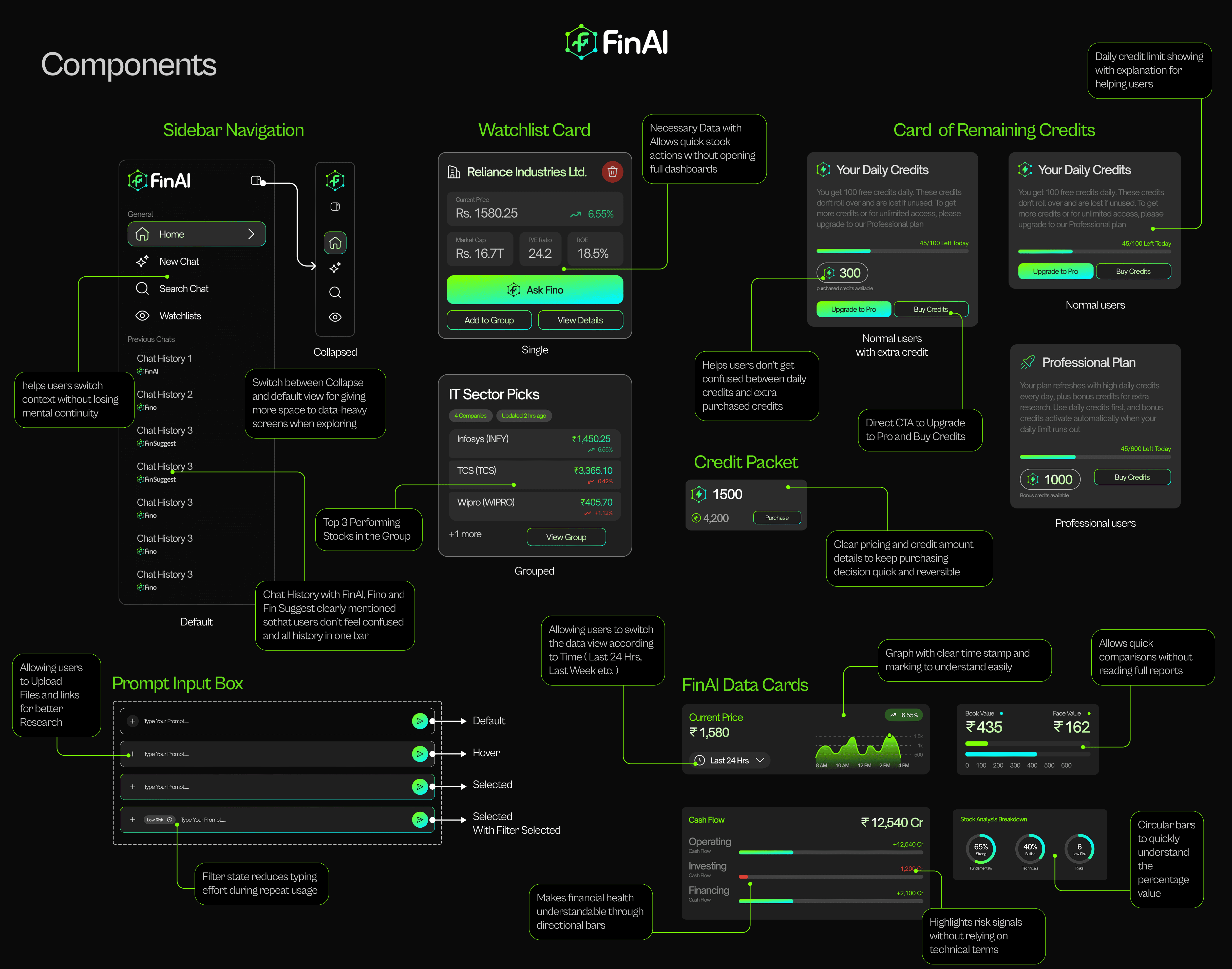
Every component was designed to guide users without interrupting their thinking flow.
Sidebar Navigation:
Default and collapsed states — switches based on screen complexity
Chat history labeled by model so users never lose context
Allows file and link uploads for better AI research queries
Watchlist Card:
Shows current price, 24-hour change, and three quick actions: Ask Fino, Compare, View Details
Group view lets users organize by sector or investment timeline
No need to reopen a company page for a status check
Credit Cards:
Two states: normal user and professional user — different visual hierarchy
Transparent breakdown: daily limit, used today, remaining
Direct CTA to upgrade or buy credits — never buried
Prompt Input Box:
Default, hover, selected, and selected-with-filter states
Filter state reduces typing effort for repeated queries
File and link attachment option for context-heavy research questions
FinAI Data Cards:
Current price with sparkline for quick trend reading
Cash flow with directional bars — operating, investing, financing
Circular chart for stock composition breakdown
Risk indicator without relying on technical jargon
What This Project Taught Me
On designing with real constraints:
The credit system was a technical necessity — API costs were real. My first instinct was to hide it. Every attempt to soften the boundary made crossing it feel worse. The honest version — here's what you have, here's what you used — turned out to be better for trust and for conversions. Transparency and business goals aligned.
Features I cut (real-time alerts, broker sync) would have taken 60% of development time for 10% of day-one user value. Scope discipline is a design skill.
On multi-model AI products:
The UX job isn't to connect the models — it's to make users never feel like they're switching tools. The moment someone thinks "wait, which tab do I need?" the product has already failed.
Three models with clear, distinct jobs beat one confused model that tries to do everything.
On designing for anxious users:
Dristi taught me the most. I kept wanting to add more data — more ratios, more indicators. Veeru kept pulling me back. Every addition we'd ask: "Does Dristi need this today, or does she need to trust the product first?" More often than not: trust first.
The right amount of information isn't the most information. It's the most useful information at the right moment.
On design decisions I'd revisit:
Run card sorting before finalizing IA — I made navigation decisions based on assumption
Show a low-credit warning at 10 remaining, not at zero — gives users agency before the wall hits
Instrument watchlist adoption in first session — users who add to watchlist on day one likely return at higher rates