

Category:
iOS App Design
Business:
B2C
Device:
Mobile UI
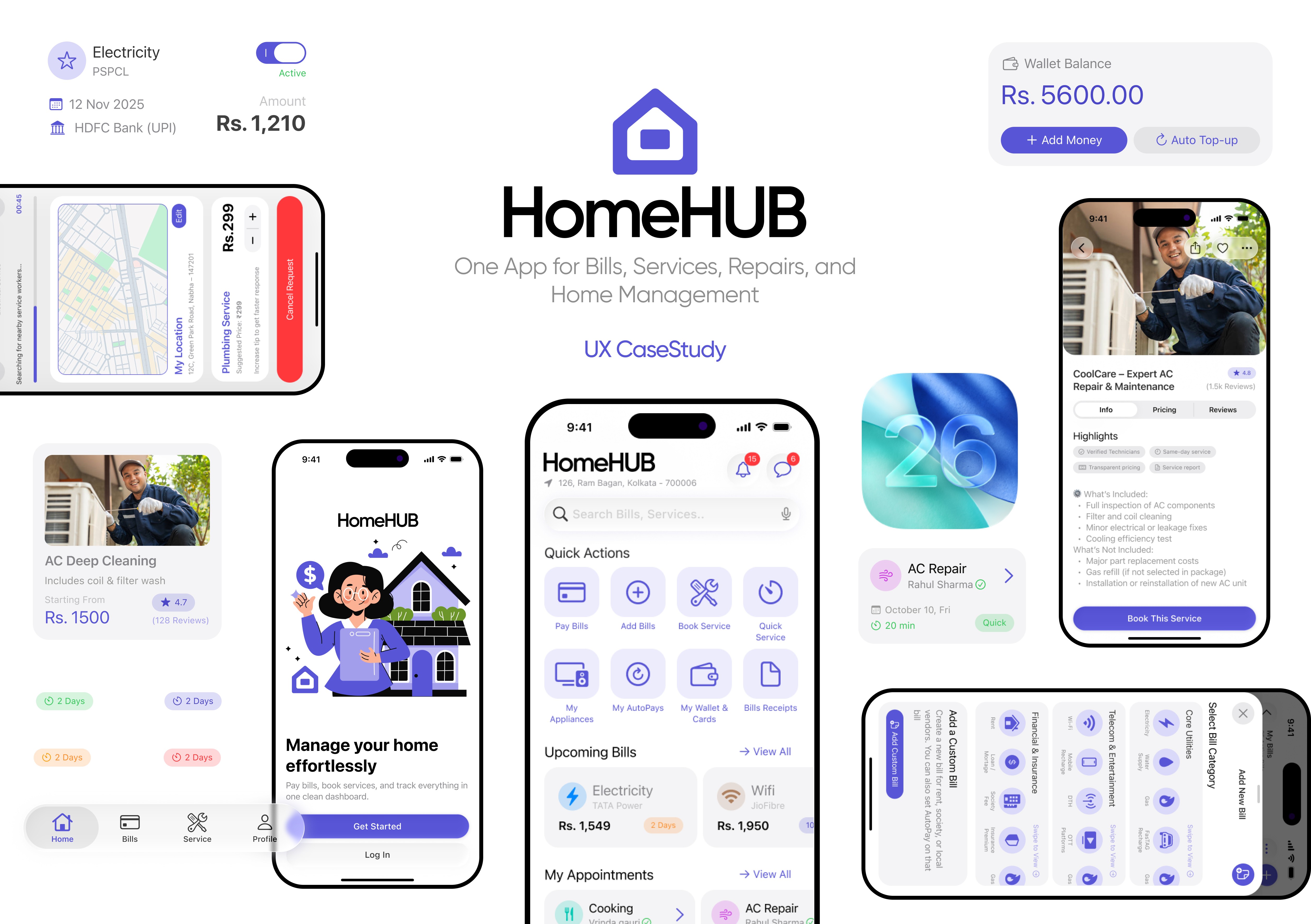
View Project
Users of Freedcamp were struggling to manage projects efficiently because important workflows felt fragmented, difficult to track, and hard to discover. Team members lacked clear visibility into task priorities, dependencies, workloads, and collaboration updates, which often created confusion, delayed execution, and reduced overall productivity. monitor timesheets, and communicate with team members. The platform contained powerful features, but poor discoverability and fragmented workflows created confusion, slowed productivity, and increased management overhead for teams.
Problem Context
Home maintenance and utility management in India is still fragmented. Users rely on separate apps for bills, technicians, receipts, and reminders. This creates confusion, missed payments, inconsistent service experiences, and poor record tracking. A centralized solution can streamline household management, improve reliability, and reduce friction in everyday tasks.
Target Customers
HomeHub primarily serves:
Urban and suburban homeowners managing multiple utilities and services.
Working professionals who don’t have time to track bills, service appointments, or follow-ups.
Renters and flat residents handling electricity, water, gas, and society-related payments.
Families who rely on recurring services like cleaning, cooking, laundry, or water delivery.
Users aged 22–45 who prefer digital payments and app-based home service platforms.
People living independently who struggle with technicians’ availability, bill reminders, and maintenance tracking.

View Project
These patterns emerged consistently across interviews:
Users prefer simple, predictable flows over heavy forms or complicated app structures.
Most don’t track appliance maintenance until something breaks.
People search for technicians last minute, often relying on neighbors or WhatsApp groups.
Bill reminders are handled using phone calendar or scattered SMS notifications.
Users are frustrated when they can’t verify technician reliability or pricing beforehand.
Quick service or emergency repair is valued highly but rarely available in organized apps.
People want a single place to see bills, receipts, and past services.
Users feel happier with an app that minimizes typing and uses UPI-first payments.
User Interview Questions
Context
Observed pain points in relatives' and friends' homes — missed bill payments, difficulty finding service providers, confusion during emergencies, and no proper place to track appliances or maintenance. Casual interviews were conducted to understand real challenges and behavior.
Interview Goals
How people currently manage home services and bills
Where confusion or delays happen
What tools or apps they depend on
What frustrates them the most in day-to-day home management
What features they wish existed
Interview Questions
Bill Management — How do you currently manage your monthly bills and due dates?
Service Booking — What is your current process for booking home services (AC, plumbing, cleaning, etc.)?
Emergency Handling — How do you handle urgent or emergency home services?
Appliance Tracking — Do you track your appliance maintenance or warranty information anywhere?
Payment History — How important is it for you to see your past payments or service history?
Users Pain Points
Fragmented management across multiple apps
Missed or delayed bill payments
Difficulty finding reliable service providers
Stress during emergency or urgent repairs
No simple way to track appliance maintenance
Lack of transparency in service status and communication.

Rajesh Kumar
Pain Points
Missed appliance servicing due to lack of tracking → expensive repairs.
Juggles 9 different utility bills across multiple apps — highly fragmented.
Technician contacts scattered across WhatsApp groups, no verified source
Paid late fees repeatedly due to inconsistent reminders
Splitting household expenses is confusing and manual
Goals
Single dashboard for all bills, expenses, and upcoming tasks
Automate payments to eliminate late charges
Structured, time-saving routines for monthly home management
Fast access to verified and trustworthy technicians
Frustrations
"Every month I waste 2–3 hours paying different bills."
"Hard to find a trustworthy technician when something breaks."
"I forget when I last serviced the AC or water purifier."
Feature Prioritization
Before wireframing anything, I ran a MoSCoW exercise to separate what the product must do from what would be nice to have. I challenged every "must-have" with: "Would a user download this app without this feature?"
Home Services
Bills & Payments
Appliances
Wallet
Should-Have (Enhances but not MVP)
Recommended services on home screen
Filter sheet for service search
Recurring service scheduling ("Set as Regular")
Notification center for bill reminders and service updates
Chat history with past technicians
What I deliberately cut: I initially considered a community/neighbor feature for sharing technician recommendations. I removed it — it added social complexity without solving the core problem faster. Scope discipline was essential.
I mapped HomeHUB's IA before touching screens. The core navigation needed to reflect user mental models — not product categories. After testing two navigation structures with three users (one with 4 tabs, one with 5), the 4-tab model won clearly:
Home · Bills · Services · Profile
This maps exactly to how users think about their home tasks. "I need to pay something" → Bills. "I need someone to fix something" → Services.
Lo-Fidelity Explorations
I sketched key flows on paper before moving to Figma: the Quick Service request model (inspired by Rapido/Uber's urgency UX), the bill addition flow, and the appliance tracker. Three key decisions I made at wireframe stage:
Bottom sheets over full screens for secondary actions — keeps context visible, reduces navigation depth
Quick Actions row on the home screen — users' most frequent tasks needed zero-depth access
Tab view for appointments (Upcoming / Cancelled / Previous) — mirrors how users mentally categorize their service history.
High-Fidelity Design
I built in iOS native components throughout — SF Symbols, bottom sheets, segmented controls — following Apple's Human Interface Guidelines. Every component decision was made to reduce cognitive load: information grouped by purpose, urgency-based visual hierarchy, and status chips that tell the story at a glance.
User Flows
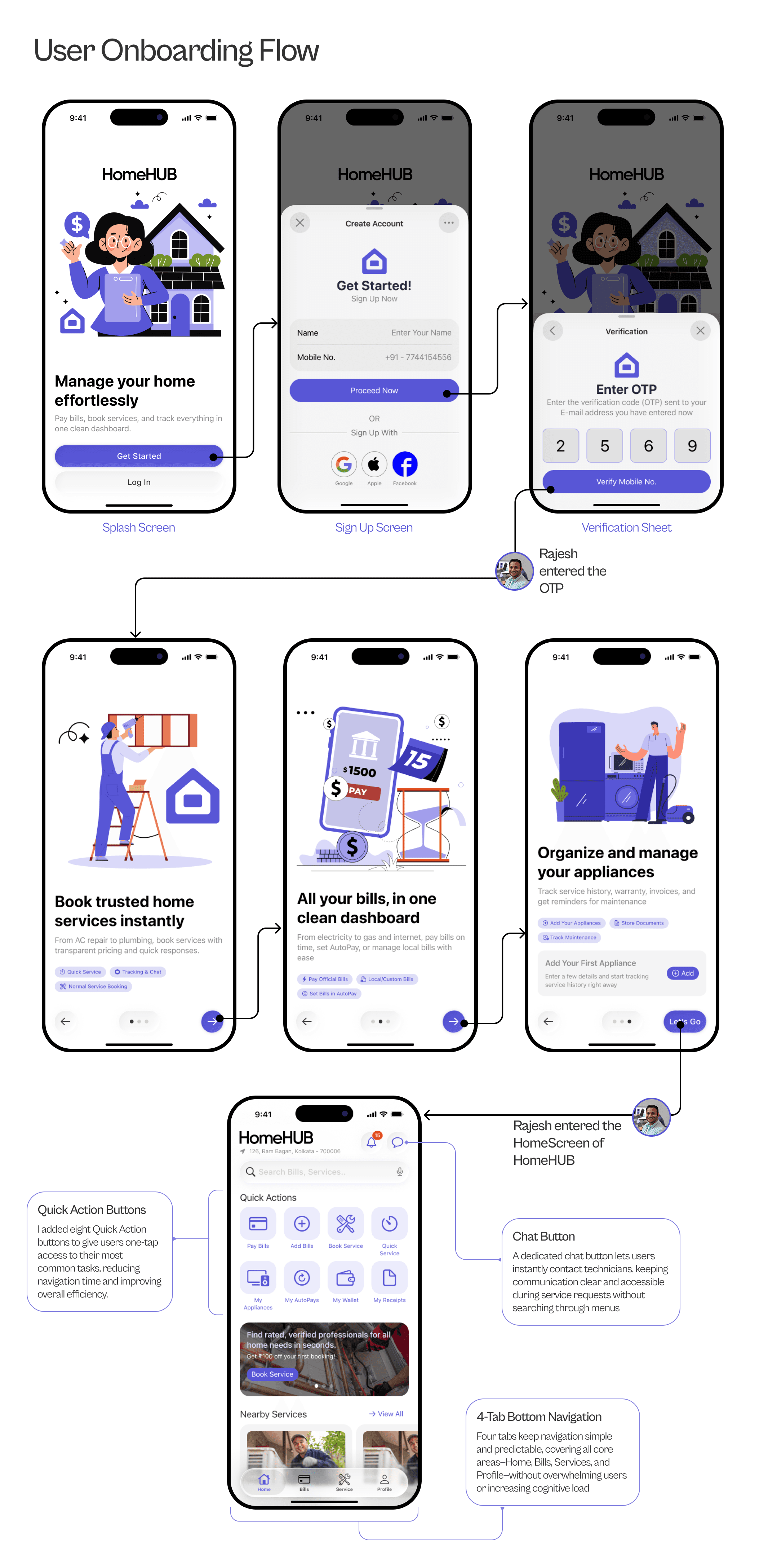
Speed and minimal friction were the design goals. Phone number signup with social login options (Google, Apple, Facebook) — no email, no lengthy forms. A 3-screen guided onboarding introduces the three core value areas: services, bills, appliances. Users who've been burned by bloated onboarding get into the app fast.
It's early morning. Rajesh wakes to find water leaking near his home's water system. He immediately opens HomeHUB.
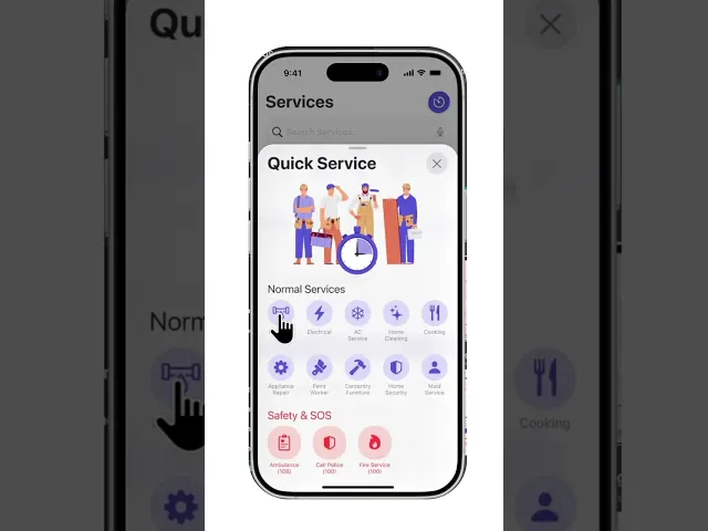
He doesn't search. He doesn't browse. He taps Quick Service — a single button on the home screen designed for exactly this moment. The flow is modeled on ride-hailing: minimal inputs, auto-detected location, live technician matching. He can see the suggested price, increase the offer for faster acceptance, and track the technician's arrival in real time. One verified technician. No WhatsApp calls. No calling 10 people.
Design rationale: In emergencies, cognitive load is the enemy. Every step that requires a decision costs the user time and trust. This flow reduces inputs to the minimum viable set for the situation.
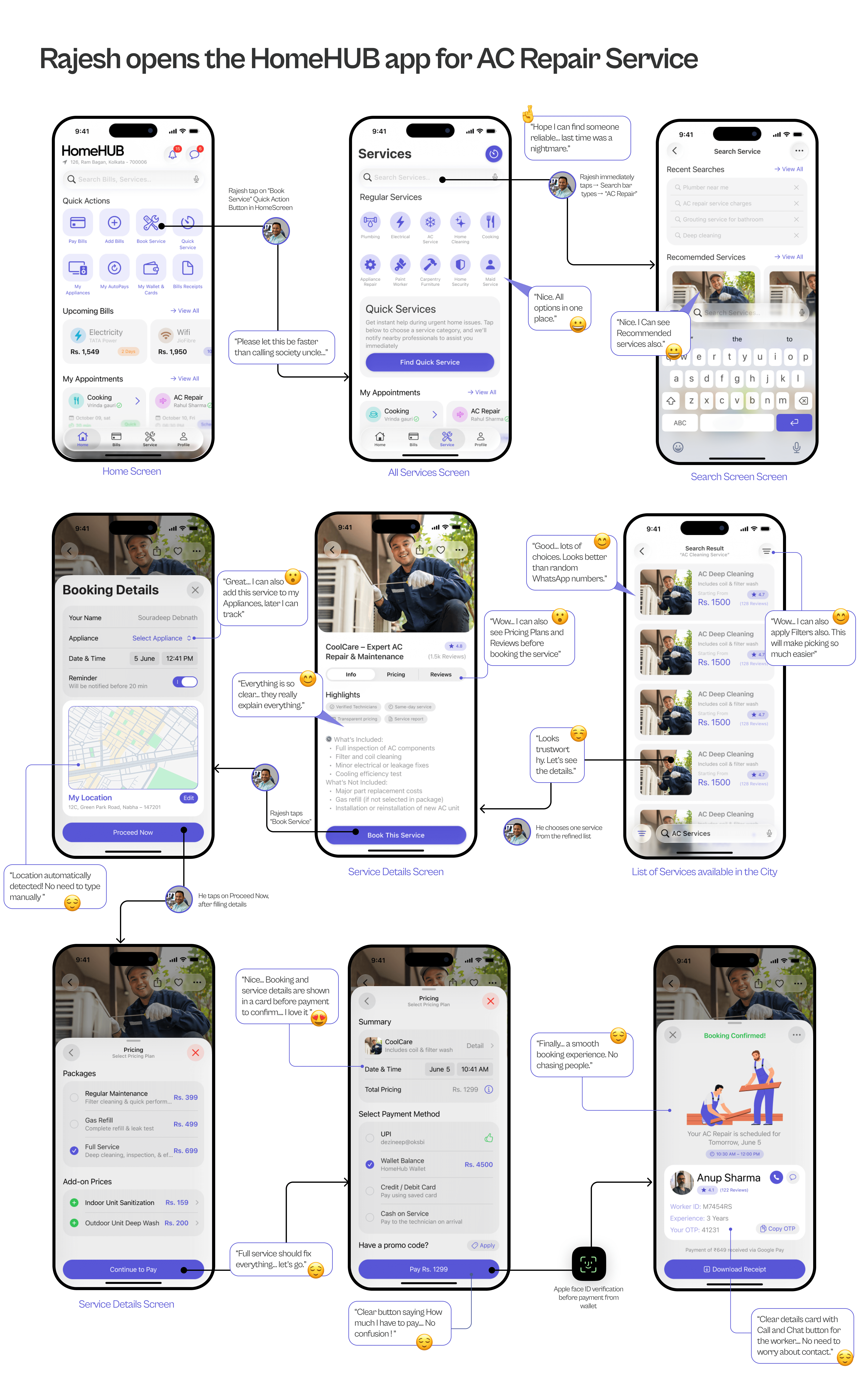
It's 2 PM on a Saturday. The kind of afternoon where the air feels like wet wool. Rajesh has been ignoring the rattle from his AC since morning. By lunch, his wife had stopped asking him to "just call someone." He picks up his phone — thumb hovering over WhatsApp — then remembers the last time. Three numbers from the building group. One didn't pick up. One quoted ₹2,500 without hearing the problem. He opens HomeHUB instead.
Design Rationale
Users arrive already frustrated — the flow had to reduce anxiety, not add to it. Upfront pricing, auto-detected location, and the three-tab service detail page (Info, Pricing, Reviews) mirror how people naturally evaluate a stranger. The confirmation screen — technician name, rating, Worker ID, OTP — exists for one reason: proof that someone is actually coming.
The day after a service, Rajesh opens his appointments. Completed services automatically move to "Previous" — no manual action needed. From any past service card, he can review the technician, rebook them, or set the service as a recurring schedule. This turns a one-time emergency into a managed routine.
Design rationale: The emotional arc after a service is relief → trust → habituation. The post-booking screen needs to reinforce trust (the technician was verified, the job is documented) and enable habituation (make it easy to schedule this again).
Rajesh adds his electricity bill. HomeHUB auto-suggests providers based on his location, fetches his bill details automatically, and pre-fills his account. He reviews the amount, taps Pay Now, selects UPI, and it's done in under 30 seconds. He then sets AutoPay for the same bill — and never thinks about it again.
Custom bills (society maintenance, water delivery) use a simple manual form with smart defaults. Everything lands in Bill Receipts, searchable and downloadable.
Design rationale: The bill payment experience in India is fragmented across multiple provider apps. The goal was to replicate the speed of single-app payments — while giving users complete visibility at every step to maintain trust.
Explore the full Figma prototype showing every flow, animation, and screen. Hit play and experience how HomeHub works from a real user’s perspective.
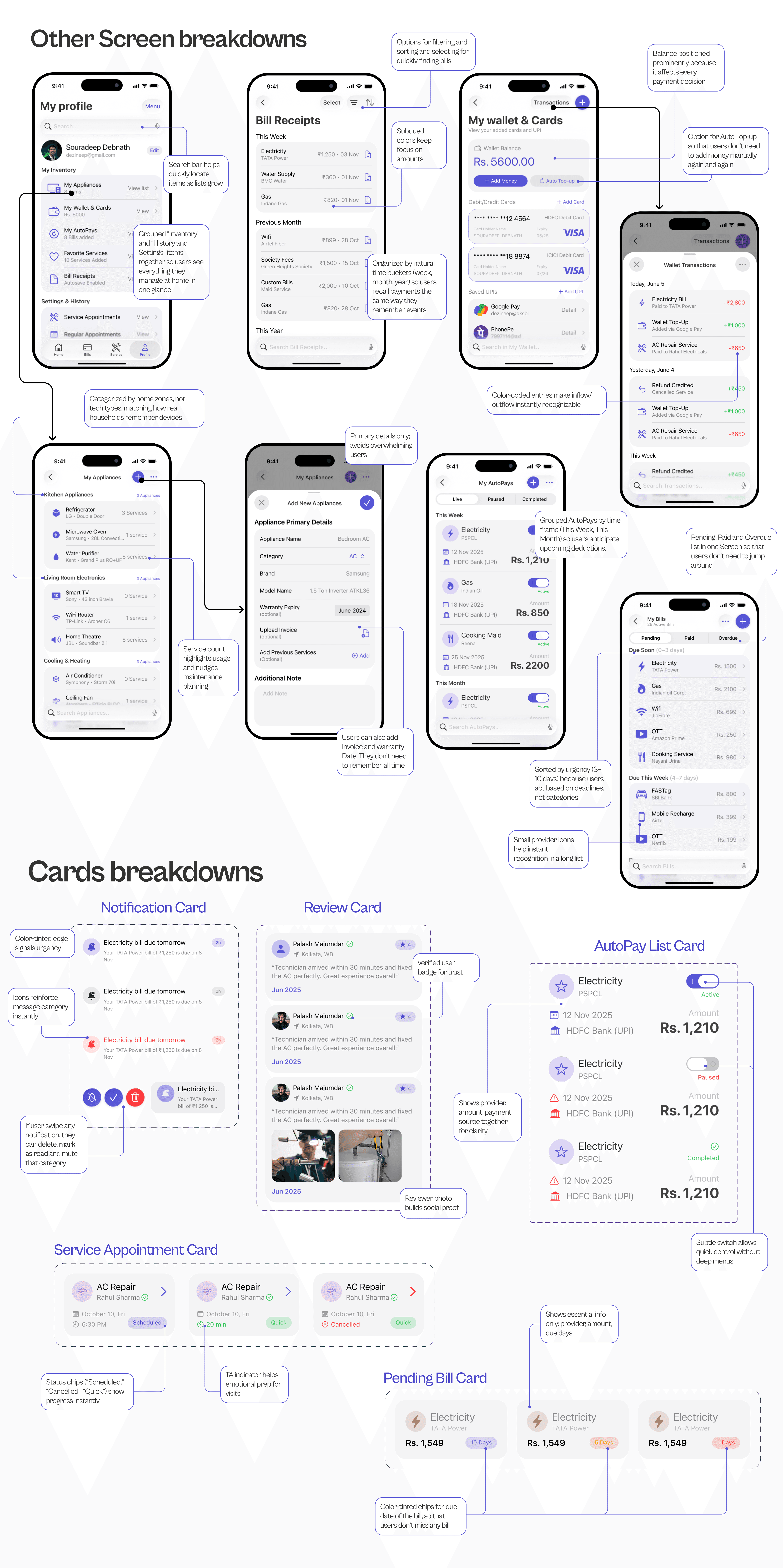
Home Screen: The Quick Actions row was the most iterated component. First version had 6 actions — user testing showed confusion. Final version shows 4 most-used actions (Pay Bills, Add Bills, Book Service, Quick Service) with a second row for deeper navigation. This reduced scan time and matched actual usage patterns.
Bill Dashboard: Bills grouped by category (Core Utilities, Telecom, Financial) — not by due date. Users think about bills by type first. Due dates are surfaced as a secondary signal (color-coded urgency chips: Today / Overdue / 5 Days).
Service Cards: Technician name, rating, and arrival time are the three most anxiety-reducing pieces of information for a user waiting for service. These are always front-and-center — never behind a tap.
Appliance Tracker: Categorized by room use (Kitchen, Cooling, Entertainment) because that's how people mentally locate their appliances. Brand + warranty date + last service date in one card = the complete picture a user needs.
Designing HomeHUB taught me something I now treat as a principle: the problem is rarely what users say it is. Nobody said "I need one app." They said "I keep forgetting my bills" and "finding technicians is stressful." The insight — that fragmentation was the root cause — only emerged by listening for patterns across all six interviews, not from any single answer.
Specific things I'd do differently:
Run a card sorting exercise before finalizing the IA. I made navigation decisions based on assumptions that felt right — but user validation would have been faster than iteration.
Design the appliance tracker earlier. It was scoped and built last, and it shows — the flow feels slightly less refined than the service and bill sections.
Define success metrics before building. What does HomeHUB look like at 90-day retention? I should have answered that before designing the onboarding.
What stayed with me: The most powerful UX moment in this project isn't a screen — it's the AutoPay confirmation. The moment a user turns on AutoPay for a bill they've been paying manually for years, something shifts. The app stops being a tool and starts being infrastructure. Designing for that transition — from task to trust — is what I want to keep getting better at.