
View Project
1 min Walkthrough
Problem → 4 Clicks Just to Check One Related Discussion
Note: This was a self-directed audit, not a client project. I tested Freedcamp myself against Asana, Clickup and Trello, then checked my direction with a few freelancer and designer friends.

Business Objective
Two things matter for Freedcamp's actual position in the market: keeping the free tier fast and frictionless enough that it stays the reason people choose Freedcamp over Asana or ClickUp, and making sure agencies and paid teams don't lose billable hours to a clunky time tracking flow. Every redesign decision below was made against one of these two goals.
What I did
Added dependencies, subtasks, timeblocks, and a working comment section.
Why I made this ( Thinking )
The task sheet was missing basic functionality: no dependency system, no subtask button, no recurrence, no way to start a timer from the task, no linked milestones, no checklist, no timeblock system, and the comments section itself was broken.
The Impact
A screen that couldn't do the job now can, in seconds. Users can discuss about specific task and see its status updates inside that sheet

What I did
Grouped the sidebar by what it does, not by feature name. Rebuilt search with filter chips instead of dropdowns.
Why I made this ( Thinking )
New users couldn't tell a Project from a Module from a Discussion. If you can't tell things apart, you stop trying to find anything.
The Impact
Faster to find things, less guessing.

What I did
Replaced nested dropdowns with simple filter chips.
Why I made this ( Thinking )
Freelancers avoided search entirely because the old form broke their flow mid-task
The Impact
You find the answer as fast as you ask.

What I did
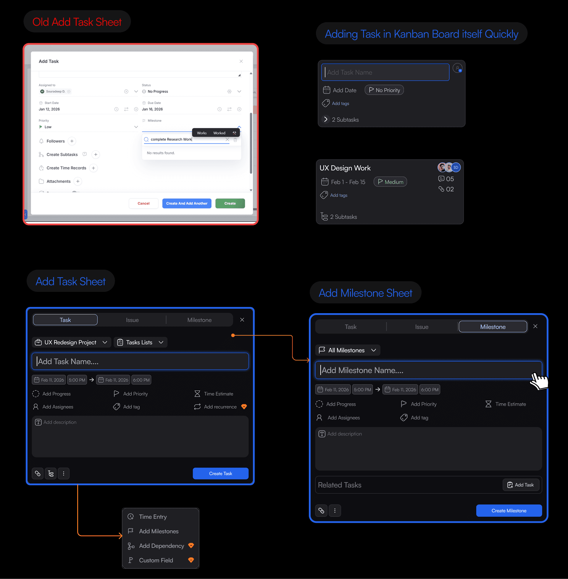
Inline entry, one sheet now switches Task, Issue, or Milestone and Also I included direct task adding with inline text fields, built right into the Kanban columnn.
Why I made this ( Thinking )
A popup breaks your train of thought. And most teams don't just add tasks, they add issues and milestones too, so forcing 3 separate flows for one action doesn't make sense
The Impact
Add anything ( Task → Issue → Milestones ) without leaving the sheet and Adding tasks feels instant fast now because of direct task adding in Kanban Board.
What I did
Pinned a live timer to the global header, Also introduced recent time entries added and CTA to redirect users to Timeboard
Why I made this ( Thinking )
If you can't see a timer, you forget it's running. That's not a UX nitpick, that's lost billable hours. Team Members sometime need to recent time entries quickly.
The Impact
Nobody forgets to log time anymore. They get to know if the timer is running. Recent Time Entries added so that users don't need to open timesheet repeatedly ~ helps to reduce extra 2 steps.

This came from informal walkthroughs, not a real product launch. Saying that plainly, not hiding it.
Freelancers said the old task form was their biggest complaint about the app. The inline entry with the Task/Issue/Milestone switcher was the first thing they noticed.
Designer friends could tell who was overloaded within seconds, no explanation needed.
Nobody needed the header timer explained. The placement made the point by itself.
I designed a multi-step approval flow for logged time. Feedback said it slowed things down and felt like bureaucracy. Cut it.
I tried adding activity feeds and issue trackers to the main dashboard. It turned into noise. The dashboard's only job is showing workload at a glance, so I removed everything that got in the way of that.
The Task Details redesign didn't happen in one pass. Here's the version that got rejected, and why.
First attempt (rejected): Added the missing features → Dependencies, Time Blocks, Subtasks, but stacked them all in one long vertical list with 4 full-width buttons on top. This fixed the missing functionality, but created a new problem: a long scroll and a cluttered screen.
Final version: Same features, reorganized into tabs. The 4 full-width buttons became icon buttons. Added an option to collapse the whole sheet.
Why in this order: Fixing missing functionality and fixing bad organization are two different problems. Solving both at once would mean guessing at layout before knowing if the features even worked. Building the first version proved the functionality was right, the final tabs just fixed how it was presented.

Complex tools need to hide things until you actually need them. Showing everything at once is not a feature, it's a failure to prioritize.
Cutting something you already built is harder than adding something new. Usually, it's the right call anyway.
Moving a timer to the header isn't just a design choice. In a services business, an hour you forget to log is money you don't get paid.
Prototype Videos
Onboarding & Workspace Personalization Flow
Demonstrates a seamless user landing transition into a clean, dual-mode dashboard interface.
Showcases how team members instantly toggle between active daily task checklists and a time-bound calendar agenda view.
Illustrates the low-friction personalization of the workspace foundation without causing visual or cognitive disorientation.
Frictionless Team, Project & Task Creation
Displays rapid-fire task dumping through instant, inline text entry fields built directly inside the Kanban board columns.
Highlights the step-by-step setup wizard that requests only naming and presets to build rapid user momentum during workspace initialization.
Features the universal Quick Add hub used to quickly generate tasks, milestones, events, or channels from any view
High-Level Team Progress & Performance Tracking
Showcases the centralized operational command center aggregating multi-project velocity, individual utilization, and real-time activity metrics.
Demonstrates interactive project completion rate sheets that break down delivery health using circular charts and progress tracking rows.
Highlights how managers can scan team-wide task distributions in seconds to balance workloads and isolate project bottlenecks early.